

Las Aztecas de la Ciudad de México
The NBA heads across the border with this expansion brand
My project takes shape with the hypothetical NBA expansion team, Las Aztecas de la Ciudad de México, or the Mexico City Aztecs. The team’s branding honors the history of the Aztec people, its unique culture employed within the design of the team.
The goal with this identity package is to fit into the current brand of the National Basketball Association while also delineating in meaningful ways. The three-color combination presented is unique to major American sports.
I aimed for a retro, 2D look that pays homage to the playfulness of ABA franchise branding. Some teams that migrated from the ABA were the San Antonio Spurs and the Denver Nuggets, and I hope that it is clear that the Aztecas is very much in line with the spirit of that 1970s vibrancy.

The primary logo features a pyramid emblem whose sun is replaced by a rising basketball. In the center of the emblem is a hidden letter "A."
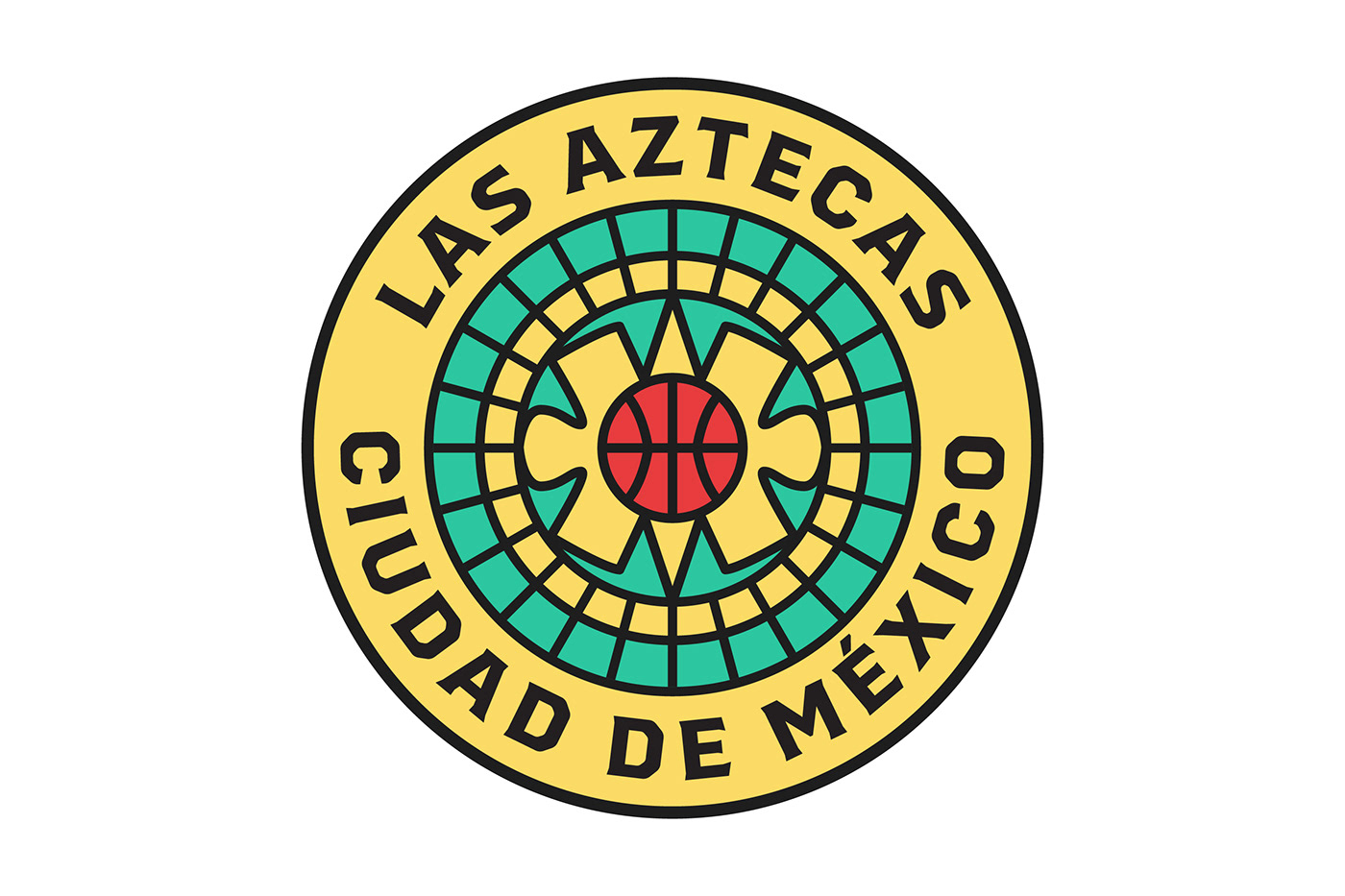
The roundel secondary logo references the Aztec calendar.

The tertiary emblem emphasizes the importance of the resurgent Mexico City (CDMX) while also establishing a patterning language.

The visual language is inspired by the vibrance of Mexico City both from the perspective of a citizen of Mexico and from one of the United States. The brand reaches above the cliché cultural hallmarks known here in the United States and instead ventures to cherish and honor Mexican and Aztec culture alike.
The court design below, meanwhile, serves as a culmination of all brand elements into one image.

Uniform Collection


from left to right:
Association: In line with the Nike x NBA uniform line, the Association Uniform sports a classic eggshell white tint with gold lining. The typographical colors honor Mexico and its rich history as a nation of proud, hardworking individuals. The goal was to make the uniform set feel vintage and fit in with the rest of the NBA’s variety.
Icon: The Icon Uniform recognizes the blossoming history of this brand new NBA team, its brand present in a rich array of colors. The black uniform connotes speed and intensity, and its red and yellow typography convey strength and fortitude, giving the team the competitive edge.
City: The City Uniform honors Mexico City as the host city for the 1968 Summer Olympics, as the primary word mark borrows from the original Olympics branding. Additionally, the colors combine to make the five-ringed Olympic emblem. The uniform also honors the student and labor protests that occurred in Mexico at the time.

Thank you for viewing!


